With US unemployment dropping to 5.5%, there has been some concern about a possible acceleration of inflation. I'm going to explain why I don't think there is any risk. The chart below shows inflation in red and unemployment in blue. Inflation is at levels unseen since the 1960s. In the past 20 years unemployment has dipped below 5% on a couple of occasions without causing inflation problems.
The next chart shows the annual percentage increase in wages in blue and the unemployment rate in red. In the past 50 years, wage growth has never been this low for this long. This a sign of a labor market which is weaker than the unemployment rate indicates.
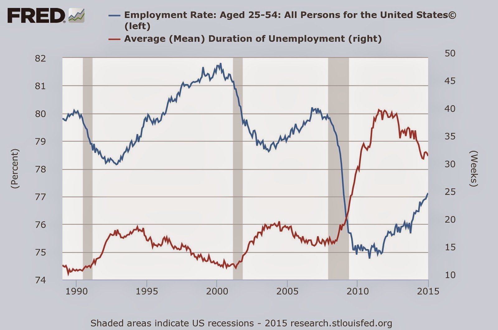
The next chart shows just how badly the labor market was damaged by the great recession. It also shows that the recession is far from over for the American worker. The red line shows the mean duration of unemployment, which soared in the Great Recession, and has yet to come back to normal levels. The blue line shows the percentage of the population between 25-54 years of age who is employed. This plunged in the Great Recession, and only about half of the damage done has been repaired.
House building and the auto industry are two of the big motors for the economy. The next chart shows that housing starts, in blue, are still at recessionary levels. The red line shows auto sales which have fully recovered.
The financial world's concern about inflation can be gauged by looking at the difference between ordinary bonds, in blue, and inflation indexed bonds shown in red. Clearly Wall Street is unconcerned by the US inflation outlook. They seem to be expecting inflation to stay under 2% for the next decade.
What surprised me most when I made these charts, is how much damage the economy still has from the 2008 financial crisis. There is currently some talk of the Fed raising interest rates. I hope they delay that until the economy has fully recovered.