Sunday, November 23, 2025

Causes of the Vibecession - Why Americans are unhappy with the economy

Despite good unemployment and inflation numbers, sentiment on the US economy is currently very negative. Paul Krugman addressed this in his recent  post.

It is hard to explain why people are so very negative right now. However, there are signs that people are struggling with debt. Interest rates are at the highest levels in twenty years. 


New York Fed data shows that serious delinquencies on credit cards, student loans and auto loans are surging. Credit card delinquencies are back to levels last seen in the aftermath of the 2008 financial crisis.


Meanwhile, after tax income for most groups is barely keeping pace with inflation, while real incomes for the lowest paid are falling.


Also, housing is a large part of most Americans net worth, and real median house prices are falling. 


Meanwhile, the stock market is up 48% in real terms over the past two years, so the wealthy are still doing very well.


Monday, March 23, 2020

New York under heavy assault from the virus


The level of infection in New York state is soaring. Infections are concentrated in the New York metro area. On March 23nd, Westchester county had 3050 confirmed cases per million people, which is ahead of Lombardy in Northern Italy which has 2854 cases per million people. New York City is a little behind with 1465 cases per million.

Seattle and New Orleans are also experiencing severe outbreaks.

Sunday, March 22, 2020

Potentially useful US military assets for the fight against COVID-19

Most of the US military is useless for the fight against COVID-19. However there are some bits and pieces of gear that might be useful.

US military protective suits


 The US military has a large stock of protective suits and gas masks which were intended to protect soldiers from biological and chemical weapons. Viruses have been used as biological weapons, so these suits and masks would probably provide protection against COVID-19. The suits are hot, heavy and uncomfortable to wear. They could be used to relieve the desperate shortages of protective equipment currently being experienced by hospitals.
Wikipedia article

US army field hospitals


The US army appears to have 22 combat support hospitals, which can provide up to 250 beds each. Potentially, they could provide 5500 beds. Most of these are in the reserves. They might not  be suitable for infectious disease, if the beds are located close together. They are really designed to provide surgery for battlefield injuries. Also, staffing them would require taking staff from medical facilities serving military bases and possibly Veterans hospitals. Taking military doctors from one area of the country to send them somewhere else is likely to be controversial.
Wikipedia article on Combat support hospitals

US Army Corps of Engineers

Army engineers could rapidly build temporary hospitals to provide extra bed capacity. They could also help to convert existing assets like convention centers and hotels into hospital and quarantine facilities.

US Navy hospital ships 


The US Navy has two 34 year old hospital ships, the Comfort and the Mercy. One is in port in Norfolk, and the other is in port in San Diego. Each has 1000 beds. They were designed for treating battlefield casualties, so their effectiveness for handling infectious disease patients is uncertain. Cruise ships have proven to be very bad environments for stopping the transmission of COVID-19. It is possible that these ships could not properly isolate infectious patients. The hospital ships might be suitable for providing normal medical services to the victims of heart attacks and accidents, allowing shore based hospitals to concentrate on handling COVID-19 patients. Staffing the ships could be an issue, as it would likely mean taking doctors and nurses away from existing shore based jobs.

Wikipedia article on Mercy-class_hospital_ship

Ski towns breed covid-19


There are numerous indications that ski towns are incubators for covid-19. To compare outbreaks in different size regions I look at the number of cases per million people. By that metric the most intense outbreak in the US is around the ski areas of Aspen and Vail Colorado (as of March 21st 2020). That really surprised me when I first discovered it.

In Italy, the second most intense outbreak is in the tiny Aosta Valley in the Alps. This area borders France and Switzerland. As of March 20th, this area has 2445 cases per million people, which is just behind Lombardy with 2532 cases per million. The case load is rapidly growing.

At the other end of the Alps, the Austrian ski resort of Ischgl played a major role in transmitting covid-19 to Norway and Iceland. The Icelandic government warned of the danger from Ischgl on March 5th when a plane carrying  15 covid-19 cases arrived in Iceland. 14 of the 15 infected passengers had been to Ischgl. Despite the warnings from Iceland, the Austrian government kept the resort open for  days in a bid to protect tourism profits. The Norwegians later found that 41% of their cases were in people who returned from Austria.

It seems that people traveling for ski vacations to the Alps and Colorado played a big role in spreading covid-19 around the world. Also, conditions in those ski towns appear to have been ideal for the transmission of covid-19, so they provide an example of the kinds of places that are most hazardous.

The Austrian ski town that spread coronavirus
How an Austrian ski paradise became a COVID-19 hotspot
Aspen to Australia
Vail to Mexico

Saturday, March 21, 2020

American counties worst affected by coronavirus as of 3/20/20


 The chart shows the ten worst affected counties in the US, with badly hit areas of China and Italy included for comparison.

The worst hit region in the US is the central Colorado ski region around Aspen and Vail Colorado. This is shown in the chart as Eagle County, Gunnison County and Pitkin County in the state of Colorado. Although the absolute number of cases is under 100 these are small towns with a very high per capita rate of cases.

The next worst hit area is the New York Metro area with Westchester County as the worst affected region. New York City, Nassau and Bergen county New Jersey are also in the New York metro area.

There are also nasty outbreaks around New Orleans (Orleans Parish) and Seattle (King and Snohomish Counties). Things have slowed down in the San Francisco Bay Area over the past couple of days, so no Bay Area counties make the chart.

In my opinion, there is a good chance that the outbreaks in New York and New Orleans become as severe as the outbreak in Northern Italy.

Wednesday, March 18, 2020

Coronavirus travel bans work: How China contained the virus

China was fairly successful in containing the worst of the coronavirus outbreak to Hubei province.The chart below shows the case rates per million people for all the provinces in China


The case rate per million in Hubei went as high as 1145 per million people. No other Chinese province exceeded 22 per million people. This degree of containment was a huge success for the Chinese authorities. In my opinion, it was due to an unprecedented travel ban introduced on January 22nd for the city of Wuhan. This was expanded next day to cover 35 million people in Wuhan and the surrounding cities. US experts interviewed  at the time were skeptical that the travel ban would work, but in hindsight it seems to have been a big success.

Also important for containment was the vigorous public health response in other Chinese provinces. The travel ban ensured that other regions were not overwhelmed by infected people coming out of Hubei.

Reducing the load on the health care system seems to have had a big impact on the death rate. The death rate was 4.5% for Hubei province but only 0.9% for the rest of China.

The US is currently doing a much less effective job of containing the virus than the Chinese did. After Hubei, Zhejiang was the worst affected Chinese province with 21 infections per million people. Several US states are now above that level.


However, I think there is still time to avoid severe, widespread infection by imposing travel restrictions on the worst affected states. Seattle, the San Francisco Bay Area, the New York City Metro Area, Louisiana, Colorado and Massachusetts are the worst affected areas. Shutting down passenger air and rail travel from those regions could prevent them from sending large numbers of infections to the rest of the US.

NY Times January story on Wuhan travel ban

Thursday, June 1, 2017

Government bond yields and trade

Most discussions of trade imbalances focus on the desirability of the goods that a country produces. Countries with trade surpluses are believed to be those that produce highly desirable goods.

However, trade imbalances are linked to capital flows. What if it is the demand for capital flows that drives the trade deficit, rather than the other way around? Capital flows from regions of surplus, where interest rates are low, to regions where interest rates are higher.  Government bond yields provide a measure of the demand for capital.

The chart below provides some evidence for this point of view. It shows that trade surplus countries tend to be countries where government bond yields are very low, indicating a surplus of capital.


The lowest bond yields are in Switzerland and Germany , while the highest are in Australia, Italy and the US.

Data note:  Government bond yields are for the 10 year bond on 5/31/2017. The data are from the Bloomberg or Trading Economics website.  The current account balance data is from the OECD stats website.

Wednesday, May 31, 2017

Home ownership and trade

There appears to be a negative correlation between the home ownership rate and the current account balance for advanced economies. Below is a chart showing the data.


Here is the same data plotted in a way that makes the correlation more obvious.


I have a couple of theories about why these two variables are linked.  Countries with high home ownership rates may have policies that make it easy to get mortgages and other forms of consumer credit. This leads to strong demand for savings which tend to drive capital inflows and associated trade deficits.

Another theory is that home ownership reduces the need for cash savings in bank accounts. People who own houses never have to pay rents and they don't have to worry about inflation in housing costs.  Less bank saving is offset by capital inflows and associated trade deficits.

Friday, September 23, 2016

Which American President produced the best growth in incomes?

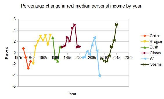
To answer this I will plot the change in real median personal income for each President's time in office. I'm plotting the fractional change in income from the year before the president entered office.  A fractional change of 1.2 corresponds to 20% income growth since that president entered the White House.


The winner here is Bill Clinton, with Ronald Reagan a strong second.  This chart clearly shows that some Presidential terms are much better for workers than others.  Obama's performance was very poor in his first term, and he is going to finish well behind Reagan and Clinton.

Below I show the same data displayed in a different way. Real income growth in 2015 was the strongest in the past 40 years. Another few years of that kind of performance would be very helpful for American society.


How do modern Presidents compare with those from the 1950s and 60s like Eisenhower, Kennedy and Johnson? The real median personal income data only goes back to 1976, so I went looking for another income data series. The best I found was real compensation per hour for the non-farm business sector.  The deterioration in performance from the era of Eisenhower to modern times is really quite shocking. There is a big step down in growth after 1970 and another one after 2008.


This measure shows that President Obama has had the worst growth in real hourly compensation of any President since at least 1953. Real hourly compensation data looks worse for Obama than real median personal income. Hourly compensation is linked to wages, while personal income includes investment income and other income sources as well as wages.


Notes and data sources

1/ All data is from FRED. I am using the non-seasonally adjusted Real Median Personal Income in the United States    series set to show percent change from a year ago.  I get non-farm real hourly compensation from here.

2/ 'W' is George W Bush who was President from 2001 to 2008. 'Bush1' is the first President Bush who served from 1989 to 1992.

3/ Carter served from 1977 to 1980. Reagan served from 1981 to 1988.

4/ 'Real' income shows growth in purchasing power after inflation is taken into account. 'Median' income is more relevant to the middle class than average income, which is increased by rising incomes among high earners. 


Saturday, August 20, 2016

Some pictures from the John Muir Trail in Yosemite National Park


Last week I hiked a short section of the John Muir Trail in Yosemite National Park. These pictures are from the Lyell Canyon area south of Tuolumne Meadows.


This area is within a few hours of the road, so no overnight camping is required.


Wednesday, August 10, 2016

A relationship between inflation and growth in wages and employment for the US economy

Some folks are speculating that the US economy is approaching full employment. In this post I'm going to explain why I don't believe that is so. I'm going to describe a Phillips curve like relationship between the core rate of inflation, wage growth and job growth. This is something of a work in progress. It seems to work well for the US economy, and a very similar approach appears to work for the UK, but I have not applied it to other economies yet.

On the y-axis I will plot the percentage growth in the product of wages and employment. For example, for January 1965 wage growth is 3.2% and employment growth is 3.6%. The quantity (wages*employment) grows by a 7% and this I plot on the y-axis.

The US economy seems to take time to respond to changes in employment and wages. On the  x-axis I will plot core inflation delayed by 21 months. For example, for the January 1965 data point I use the inflation from October 1966.


The best fit line shown on the chart predicts 2.2% inflation in October 2017 based on current rates of wage and job growth.  The growth in (wages*employment) is currently 4.4%, and it has never gone above 7% since 1992. In that time inflation has stayed under 3%.

Under what circumstances should we be concerned about a return of inflation? When inflation took off in the late 1960s the  growth of (wages*employment) was a little over 8%. From 1972 until 1981 it never fell below 7%. As long as it stays under 7%, inflation should stay low.

With growth in (wages*employment) at 4.4% as of January 2016, there is clearly a lot of room for stimulating the economy. When we approach full employment, wage growth should rise substantially.


 Notes and data sources

1/ All data is from FRED. For wages I am using the  "Average hourly earnings of production and non-supervisory employees: Total Private (AHETPI) " The data is seasonally adjusted. For January of each year I take the percent change from the previous year.

2/ For employment I am using "All employees : total nonfarm payrolls (PAYEMS)" seasonally adjusted. For January of each year I take the percentage change from the previous year.

3/ For core inflation I am using "Consumer Price Index for All Urban Consumers: All Items Less Food and Energy (CPILFESL)" I take the annual rate of change delayed by 21 months. For example, (earnings growth * employment growth) for January 1965 is plotted against inflation for October 1966.

4/ Care needs to be taken with the arithmetic. For example, wage growth of 3.2% is a factor of 1.032. Employment growth of 3.6% is a factor of 1.036. Earnings growth * employment growth = 1.032*1.036 = 1.069 which is equivalent to 6.9%.

Friday, June 5, 2015

California vesus Texas Job Growth: 2015 update: Why is California doing so well?

In the first decade of the 21st century California struggled to create new sustainable jobs. The housing boom created jobs for a time, but those disappeared when housing went bust, leaving employment little higher than it had been in 2002.

One welcome surprise during the past few years has been how strongly Californian employment has grown. A state that some feared was headed for stagnation has shown it can still create a lot of jobs when times are good. It remains to be seen how many of the new jobs will survive the next downturn.

Northern California is currently enjoying another tech boom, and it is tempting to credit the Californian recovery to the success of Silicon Valley.  That however is not the whole story. California is a very large and diverse state. Los Angeles is a different economy from the Bay Area, and the Central Valley is different again.  To better understand things, I have looked at job growth by region using data for metro areas.

What I found was that the San Francisco area, which contains Silicon Valley, was only responsible for a fraction of the state's job growth. The Los Angeles area and the Central Valley also created lots of jobs.
If we look at employment growth per 1000 population the exceptional performance of the tech powered San Francisco area becomes clear. However, LA and the Central Valley are also doing well and compare favorably to the growth rates in other states over the same period.


Why is California doing so well? One reason is that it is a highly urbanized state, with few people living in struggling rural areas. Californian cities tend to be large, and nationwide larger cities tend to be more attractive to employers than small ones. Another point is that Californian wages are not particularly high, perhaps because of the housing bust.

Monday, March 30, 2015

California versus Texas Job growth: 2015 update: Part 1

This is an update to a series of posts I did four years ago, which tried to understand why some states produced jobs and others didn't. At the time, a lot of people pointed to the success of Texas in creating jobs, while California was seen as an example of stagnation.

Texas continues to be one of the leading job creating states in the country.  However, California has had a big comeback, and is now doing almost as well as Texas at job creation.

To properly compare states, I have calculated the job growth per 1000 residents from January 2011 to January 2015. Thanks to oil development, North Dakota comes top.  Utah and Texas continue to do very well, as they did  from 2002 to 2009. Rural southern states like West Virginia and Mississippi continue to bleed jobs, as they have for years. Massachusetts and especially California are the most improved.


The Sunbelt continues to do well, while the Northeast apart from Massachusetts continues to lag.  The Midwest has bounced back from the auto industry crisis and bail out.

(Technical notes: Employment data from Department of Labor. Population data from  Census Bureau . I am using state populations as of  April 2010)

US Inflation? Still not happening!

With US unemployment dropping to 5.5%, there has been some concern about a possible acceleration of inflation. I'm going to explain why I don't think there is any risk. The chart below shows inflation in red and unemployment in blue. Inflation is at levels unseen since the 1960s.  In the past 20 years unemployment has dipped below 5% on a couple of occasions without causing inflation problems.


The next chart shows the annual percentage increase in wages in blue and the unemployment rate in red. In the past 50 years, wage growth has never been this low for this long. This a sign of a labor market which is weaker than the unemployment rate indicates.


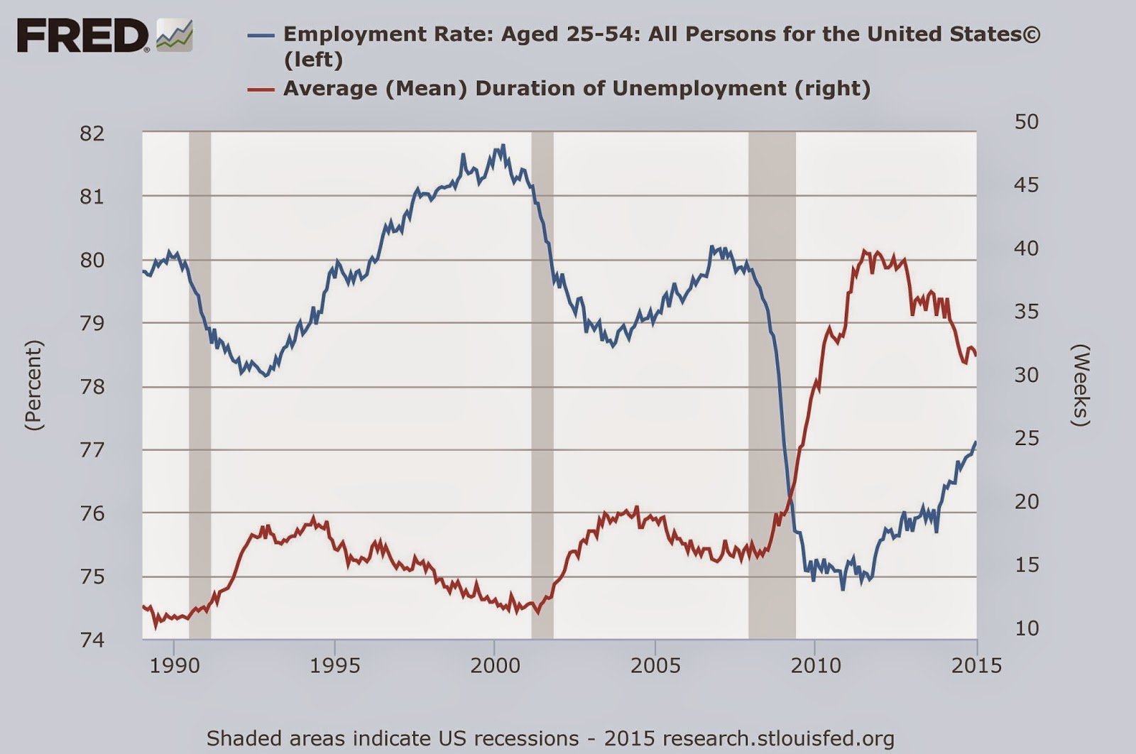
The next chart shows just how badly the labor market was damaged by the great recession. It also shows that the recession is far from over for the American worker.  The red line shows the mean duration of unemployment, which soared in the Great Recession, and has yet to come back to normal levels.  The blue line shows the percentage of the population between 25-54 years of age who is employed.  This plunged in the Great Recession, and only about half of the damage done has been repaired.


House building and the auto industry are two of the  big motors for the economy. The next chart shows that housing starts, in blue, are still at recessionary levels. The red line shows auto sales which have fully recovered.


The financial world's concern about inflation can be gauged by looking at the difference between ordinary bonds, in blue, and inflation indexed bonds shown in red.  Clearly Wall Street is unconcerned by the US inflation outlook. They seem to be expecting inflation to stay under 2% for the next decade.


What surprised me most when I made these charts, is how much damage the economy still has from the 2008 financial crisis. There is currently some talk of the Fed raising interest rates. I hope they delay that until the economy has fully recovered.

Tuesday, December 31, 2013

Did income inequality lead to the collapse of ancient Rome?

In 2013 a consensus developed among American liberals that the problem of income inequality should be a top priority. President Obama stated that income inequality was the 'defining challenge of our time'.

Income inequality was also a major issue when ancient Rome was at the height of its power.  Political struggles over income inequality destabilized the Roman system, and lead to irreversible political changes that fatally undermined Roman civilization.

The Roman city state was founded in the eighth century BC as a kingdom. After a particularly obnoxious king, the monarch was overthrown in 509 BC. Instead of replacing him with another king, the citizens of Rome did something revolutionary.  They swore an oath that no one man would ever again be allowed to rule Rome. They set up a system where no man had absolute power and where the government was accountable to the people. It was similar in many ways to our modern American system. They called it a Republic.

The Republic seems to have been very good for business. Modern science has given us some insight into Roman economic activity through the study of shipwrecks and ice cores. What is really interesting is that both unrelated datasets tell the same story. The Roman economy grew for about 500 years from 500 BC to a peak at 1AD, and then shrank away to nothing by 500 AD.


The data on lead production comes from Greenland ice cores. Lead smelting released pollution, which found its way to the Greenland icecap. The Romans were mining lead so they could use that lead to extract silver from its ore. The Romans needed silver because their monetary system was based on silver coins.

The growth in the Roman economy roughly coincides with the existence of the Roman Republic, which started with the overthrow of the king in 509 BC  and came to an end in 27 BC when the Republic was overthrown. Good institutions are vital to economic growth in the third world today, and the Republic was likely key to the success of Rome.

Much has been written about why Rome fell. What the modern data reveals, is that the economy had been shrinking for centuries before the final collapse of the Roman state. When the last Roman emperor was overthrown in 476 AD, the economy had withered away. The data also shows that the economy peaked around 1 AD, so the cause of the eventual collapse of Rome dates to that era.  The replacement of the Republic with emperors seems to be the most likely reason. Kings and emperors are very common in history, while republics are rare.

Why did the Republic fall?

What seems to have destabilized the Republic was growing income inequality.  By the middle of the second century, the economic situation for the average Roman was declining. The backbone of Rome was small farmers who owned their own land. These small farms started going bankrupt, and they sold their land to aristocrats who set up  large estates worked by imported slave labor. The displaced farmers went to the cities looking for work, but they didn't find many jobs, and ended up dependent on government welfare.

In 133 BC these unemployed people elected a populist called Tiberius Gracchus who promised them land reform. The wealthy elite resisted the reforms, and Tiberius was assassinated. This started a series of political assassinations and military coups which lead to the dismantling of the Republic by 27AD. The whole process took over a hundred years.


Tuesday, July 17, 2012

Who's afraid of inflation?: Part 2

This chart covers the US economy  from 1960 through to the present day. Core inflation is shown in red, and year over year wage growth is shown in blue.


The first point here is that inflation problems go hand in hand with stong wage growth. In the high inflation period of the 1970s, wage growth was never less than 7.5% per year. Strong wage growth in the late 60s preceded the slide into high inflation. Inflation is a problem that tends to appear in the late stages of an economic boom, not when the economy is deeply depressed. Wage growth at present is very low.

The second point is that the Fed's current target for inflation, at 2.5%, is far lower than the 3-5% inflation that prevailed during Reagan's presidency. Nobody saw inflation as a problem at the time, even though it was far above the level which the Fed now regards as acceptable. And job growth in the Reagan recovery was far better than anything which we have seen in the past few years.

Clearly the Bernanke Fed has prioritized low inflation over fighting unemployment. I believe this reflects a lack of accountability to the American public.


Wage growth isn't likely to be a problem any time soon

This chart shows wage growth in blue and the unemployment rate in green. Wages seem to take off when unemployment gets below about 5%. There is no chance of that happening in the near future because unemployment remains far too high. If wage growth stays low, so will inflation.


Saturday, July 14, 2012

Who's afraid of inflation?

Central banks continue to point to fears of inflation as their justification for not doing more to generate growth and fight unemployment. I find their concern about inflation almost impossible to understand and in this post I will explain why.

Inflation: A problem of the past

As this chart shows, inflation has been dormant since the mid-90s. It hasn't been a serious problem for 30 years, since 1982. Inflation is in red, while unemployment is in blue. And unemployment remains far above the 5% level which has sometimes sparked inflation in the past.


Global conditions don't favor inflation

When inflation was last a serious problem, in the 1970s, it wasn't just a US issue. As the next chart shows, it was a global problem. Japan is in red, the UK in green, France in orange and Germany in blue. Japan and the UK had even more serious inflation than the US. Today, global inflation is lower than at any time in the past 50 years.


The bond market isn't worried

The next chart shows the yield on ordinary 10-year Treasuries in green, and on inflation protected bonds in blue. Bond rates are lower than at any time in the past 50 years. Real interest rates are negative. The difference between ordinary and inflation protected bonds gives an implied inflation forecast of 2.5%.


Demand is very weak

The next chart shows housing starts in red, and GDP in blue. In past recoveries, falling interest rates would encourage home building, and that added demand would pull the economy out of recession. The housing market is badly broken, and housing starts remain at very low levels despite very low interest rates. In the past month there have been a few stories indicating an upturn in housing, which is a rare piece of good economic news, but there is a long ways to go to get back to normal levels.


When inflation was a problem, in the 1970s, demand was much stronger, with housing starts running at over 2 million units.  Growth surged to over 5% back then.

Today, growth is extremely weak by comparison with past recoveries. It is below 2.5%, which is unusual for an economy that is not in recession.

Car demand is also unusually weak.


Unemployment in catastrophically bad

Not since the Depression have so many been unemployed for so long, yet Ben Bernanke and the Federal Reserve don't seem to care. The longer people stay unemployed, the more skills they lose.


We have an economy with surplus capital, industrial capacity and labor, and very weak demand. This is not the sort of economy that generates inflation. Yet the Bernanke Fed appears to have given up on its mandate to fight unemployment.

Saturday, July 7, 2012

A divided Europe

The European crisis is often framed in terms of 'wealthy' Northern Europe bailing out 'poor' Southern Europe. Reality is more complicated.

Regional GDP as a percent of EU average (2009 data)

This map shows economic output by region. Dark greens show the regions of highest output, light green shows regions close to the EU average, while the poorest regions are colored pale yellow. The north-south divide runs right through the middle of Italy, and parts of northern Italy and northern Spain have output levels comparable to Germany.

Meanwhile, parts of eastern Germany have output levels comparable to Greece and southern Spain. Despite 20 years and vast amounts of aid, East Germany is nowhere near matching West Germany's economic performance. East Germany has never really recovered from having an overvalued currency after unification
Chart source: Eurostat


Judging by the very slow improvement of East Germany, it seems very unlikely that the PIGS (Portugal, Ireland, Greece, Spain) will be able to solve their problems by raising competitiveness. German experience with reunification probably explains why Germany is reluctant to give the PIGS large amounts of aid. They tried that with East Germany and it didn't work.


Regional unemployment (2010)

Chart source: Eurostat

In this map dark green shows high levels of unemployment while light yellow shows low unemployment. Southern Germany and Northern Italy are doing very well, while most of Europe struggles.

Given the divergent economic performance, a single currency no longer seems to make sense. Of course the USA also struggles with large regional differences in wealth. However, it is the vast differences in unemployment rates which will probably make the Eurozone unworkable. Salzburg region, Austria has 2.5% unemployment, while Andalucia region, Spain suffers from 30% unemployment.

Source: Eurostat


.

Sunday, July 1, 2012

Eurofail: Ireland vs Arizona

The financial crisis in Europe just won't seem to go away. While the US is still struggling to get out of the recession that started in 2008, we have at least managed to stabilize our financial system.

There are surprising similarities between Ireland, one of the first European countries to be engulfed by the crisis, and the American state of Arizona. The differences in the way the crisis was handled contain a lot of lessons about what is necessary for a successful currency union.


NamePopulation   2007 GDP per capita (2010$) Homeownership rate (2004)
Arizona 6.3 million $44,200 69%
Ireland4.6 million $46,138 81%


Annual economic growth in Ireland and Arizona was very similar before the crisis
Orange: Arizona, Green: Ireland


Unemployment rates were also very similar before the crisis, but post-crisis Arizona has done much better.
Orange:Arizona, Green:Ireland


Irish house prices have lost half their value from their peak.
 Source

House prices in Phoenix have also lost a little over half their peak value. Arizona house prices fell faster, and have now stabilized.


The lesson for Europe

Arizona and Ireland had very similar housing bubbles. Yet Arizona is now on the road to recovery, while Ireland remains stuck with very high unemployment. Both are small economies which are part of much larger currency areas.  In the US, mortgage related losses were dealt with at the Federal level.  Bank failures were dealt with via FDIC. Arizona also benefited from payouts from Federal anti-poverty programs, like unemployment insurance and food stamps.

In Ireland, all these costs had to be borne by the Irish state. The Irish state is now broke.

If the Euro is to have any chance of survival, the cost of cleaning up failed banks needs to be paid at the European level.  Money for programs like unemployment insurance also needs to come from Europe. To pay for all this, some form of European tax system will be needed.

European governments should remain free to raise their own taxes and spend money as required. Arizona doesn't need budget approval from the Federal government in Washington, DC. The  US does not have anything similar to Europe's growth and stability pact.

Wednesday, June 27, 2012

A reason the Euro failed?

The Euro is failing because of chronic current account imbalances between Northern and Southern Europe. But what is the reason for these imbalances?

Below I have plotted the homeownership rate versus the current account balance as a % of GDP for a set of major economies. The data is for 2004/2005, so it is before the crisis struck. There looks to be a reasonable correlation here, with high rates of homeownership predicting trade deficits.


The next chart shows the same data in a different style. Note that Greece, Ireland and Spain have some of the highest rates of homeownership in the OECD, while Germany has one of the lowest.


The question here is why high rates of home ownership go along with trade deficits. It's possible that people who own their own home feel more confident and are more willing to spend. I think it is more likely that easy consumer credit is responsible for both the high rate of home ownership and the excessive consumption that leads to trade deficits.

Another point here is that the Euro brought together diverse countries with different economic cultures. Maybe things would have worked better if there had been a single financial regulator for Europe.


Data sources: 2004 Homeownership: from OECD
                           2005 Current account balance from OECD