Friday, June 5, 2015

California vesus Texas Job Growth: 2015 update: Why is California doing so well?

In the first decade of the 21st century California struggled to create new sustainable jobs. The housing boom created jobs for a time, but those disappeared when housing went bust, leaving employment little higher than it had been in 2002.

One welcome surprise during the past few years has been how strongly Californian employment has grown. A state that some feared was headed for stagnation has shown it can still create a lot of jobs when times are good. It remains to be seen how many of the new jobs will survive the next downturn.

Northern California is currently enjoying another tech boom, and it is tempting to credit the Californian recovery to the success of Silicon Valley.  That however is not the whole story. California is a very large and diverse state. Los Angeles is a different economy from the Bay Area, and the Central Valley is different again.  To better understand things, I have looked at job growth by region using data for metro areas.

What I found was that the San Francisco area, which contains Silicon Valley, was only responsible for a fraction of the state's job growth. The Los Angeles area and the Central Valley also created lots of jobs.
If we look at employment growth per 1000 population the exceptional performance of the tech powered San Francisco area becomes clear. However, LA and the Central Valley are also doing well and compare favorably to the growth rates in other states over the same period.


Why is California doing so well? One reason is that it is a highly urbanized state, with few people living in struggling rural areas. Californian cities tend to be large, and nationwide larger cities tend to be more attractive to employers than small ones. Another point is that Californian wages are not particularly high, perhaps because of the housing bust.

Monday, March 30, 2015

California versus Texas Job growth: 2015 update: Part 1

This is an update to a series of posts I did four years ago, which tried to understand why some states produced jobs and others didn't. At the time, a lot of people pointed to the success of Texas in creating jobs, while California was seen as an example of stagnation.

Texas continues to be one of the leading job creating states in the country.  However, California has had a big comeback, and is now doing almost as well as Texas at job creation.

To properly compare states, I have calculated the job growth per 1000 residents from January 2011 to January 2015. Thanks to oil development, North Dakota comes top.  Utah and Texas continue to do very well, as they did  from 2002 to 2009. Rural southern states like West Virginia and Mississippi continue to bleed jobs, as they have for years. Massachusetts and especially California are the most improved.


The Sunbelt continues to do well, while the Northeast apart from Massachusetts continues to lag.  The Midwest has bounced back from the auto industry crisis and bail out.

(Technical notes: Employment data from Department of Labor. Population data from  Census Bureau . I am using state populations as of  April 2010)

US Inflation? Still not happening!

With US unemployment dropping to 5.5%, there has been some concern about a possible acceleration of inflation. I'm going to explain why I don't think there is any risk. The chart below shows inflation in red and unemployment in blue. Inflation is at levels unseen since the 1960s.  In the past 20 years unemployment has dipped below 5% on a couple of occasions without causing inflation problems.


The next chart shows the annual percentage increase in wages in blue and the unemployment rate in red. In the past 50 years, wage growth has never been this low for this long. This a sign of a labor market which is weaker than the unemployment rate indicates.


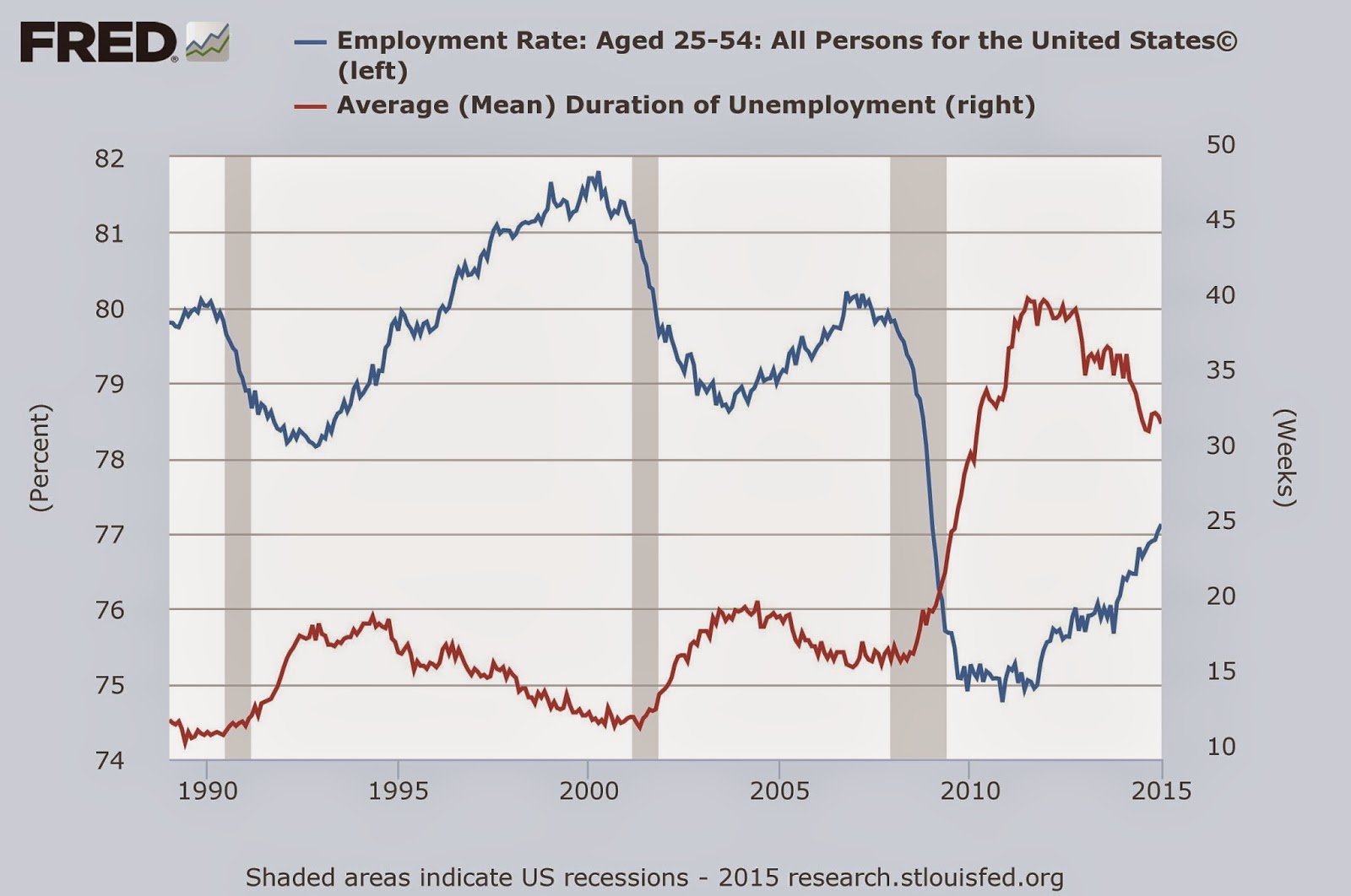
The next chart shows just how badly the labor market was damaged by the great recession. It also shows that the recession is far from over for the American worker.  The red line shows the mean duration of unemployment, which soared in the Great Recession, and has yet to come back to normal levels.  The blue line shows the percentage of the population between 25-54 years of age who is employed.  This plunged in the Great Recession, and only about half of the damage done has been repaired.


House building and the auto industry are two of the  big motors for the economy. The next chart shows that housing starts, in blue, are still at recessionary levels. The red line shows auto sales which have fully recovered.


The financial world's concern about inflation can be gauged by looking at the difference between ordinary bonds, in blue, and inflation indexed bonds shown in red.  Clearly Wall Street is unconcerned by the US inflation outlook. They seem to be expecting inflation to stay under 2% for the next decade.


What surprised me most when I made these charts, is how much damage the economy still has from the 2008 financial crisis. There is currently some talk of the Fed raising interest rates. I hope they delay that until the economy has fully recovered.